I’ve been using CSS @keyframes for quite some time, mostly for simple effects like fading elements, moving objects, and creating loading animations.
Recently, I came across an interesting article by Josh W. Comeau called An Interactive Guide to Keyframe Animations. I liked the way he explained animations through interactive examples rather than just showing CSS properties.
It encouraged me to experiment with a few animations and customize them for situations we regularly encounter while building websites.
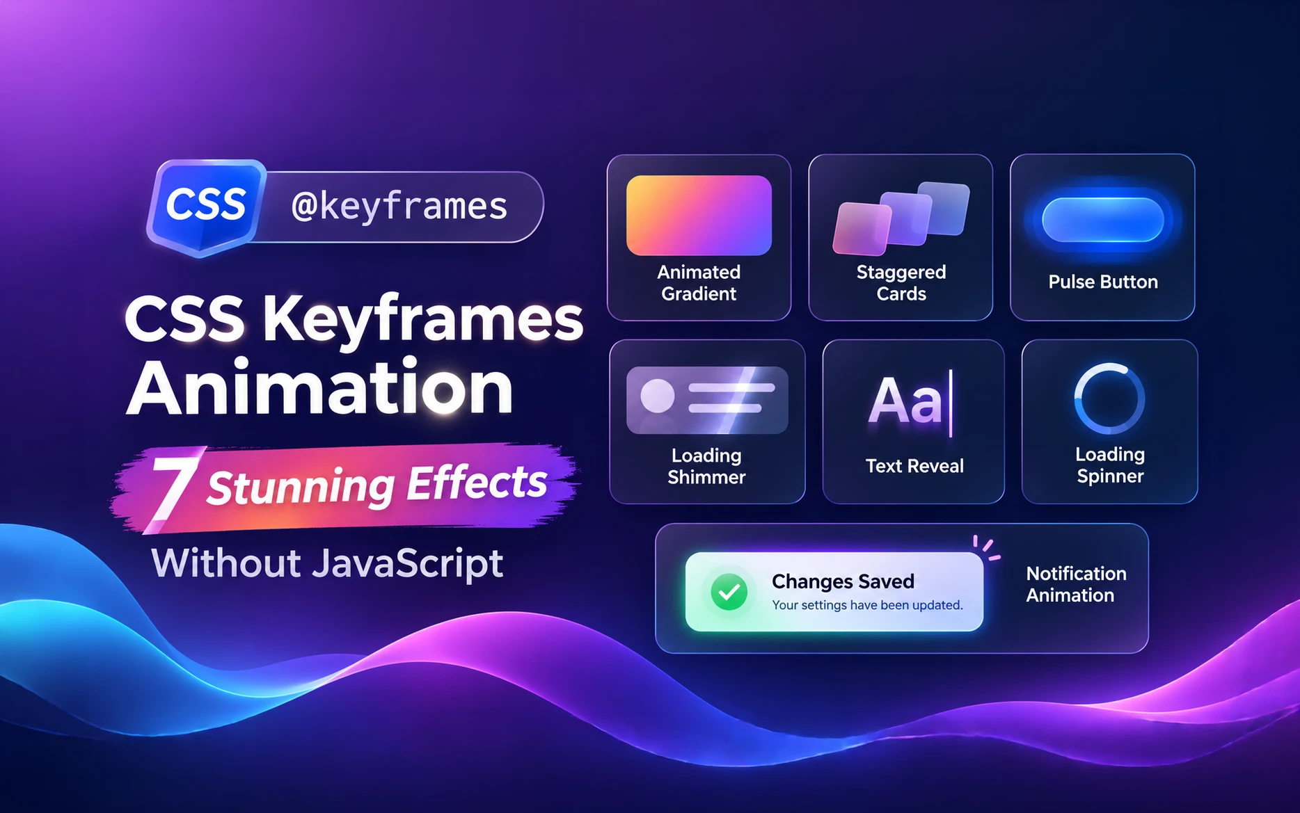
The result is this collection of seven practical CSS keyframes animation examples. Everything is built with HTML and CSS, without JavaScript or external animation libraries.
I’ve also included an interactive playground after each example so you can change the animation settings, see the results immediately, and copy the generated CSS.
Table of Contents
What Is CSS Keyframes Animation?
CSS keyframes animation allows us to control how an element’s CSS properties change over time.
Unlike a CSS transition, which typically animates between two states, keyframes let us define multiple stages of an animation.
Here’s a simple example.
@keyframes fade-in {
  from {
    opacity: 0;
  }

  to {
    opacity: 1;
  }
}

.fade-in {
  animation: fade-in 1s ease-out both;
}
The @keyframes rule defines an animation called fade-in.
The animation property applies that animation to an element, specifying its duration, timing function, and other settings.
We can also use percentages to control what happens at different points.
@keyframes move-and-fade {
  0% {
    opacity: 0;
    transform: translateY(30px);
  }

  60% {
    opacity: 1;
    transform: translateY(-5px);
  }

  100% {
    opacity: 1;
    transform: translateY(0);
  }
}
This gives us much more flexibility than simply moving an element from one position to another.
Understanding the Important Animation Properties
Before we get into the examples, let’s quickly look at the properties we’ll be using.
| Property | What it does |
|---|---|
animation-name | Specifies the keyframes to execute |
animation-duration | Controls how long the animation takes |
animation-timing-function | Controls the animation’s acceleration |
animation-delay | Delays the start |
animation-iteration-count | Sets how many times it repeats |
animation-direction | Controls playback direction |
animation-fill-mode | Controls styles before and after the animation |
animation-play-state | Pauses or resumes the animation |
You can write these properties individually or use the shorthand.
.element {
  animation: fade-in 1s ease-out 0.3s 1 normal both;
}
Personally, I prefer the shorthand for straightforward animations. When an animation becomes more complicated, writing the properties separately can make the code easier to understand.
Now let’s look at some practical examples.
Example 1: Animated Gradient Background
Animated gradients are useful for hero sections, promotional banners, and landing pages.
Instead of using a static gradient, we can introduce subtle movement by changing the background position.
HTML
<section class="animated-gradient">
  <div class="animated-gradient__content">
    <h2>Build Something Different</h2>
    <p>A subtle animated gradient using CSS alone.</p>
    <a href="#examples">Explore Examples</a>
  </div>
</section>
CSS
<style>
  .animated-gradient {
    --gradient-one: #0f172a;
    --gradient-two: #2563eb;
    --gradient-three: #7c3aed;

    display: grid;
    place-items: center;
    min-height: 350px;
    padding: 40px 24px;
    overflow: hidden;
    border-radius: 16px;

    color: #fff;
    text-align: center;

    background: linear-gradient(
      120deg,
      var(--gradient-one),
      var(--gradient-two),
      var(--gradient-three)
    );

    background-size: 250% 250%;

    animation: keyframesGradientShift 10s ease infinite alternate;
  }

  .animated-hero__content {
    max-width: 600px;
  }

  .animated-gradient h2 {
    margin: 0 0 16px;
    color: inherit;
    font-size: clamp(2rem, 5vw, 3.5rem);
    line-height: 1.15;
  }

  .animated-gradient p {
    margin-bottom: 24px;
  }

  .animated-gradient a {
    display: inline-block;
    padding: 12px 24px;
    border-radius: 6px;
    background: #fff;
    color: #0f172a;
    text-decoration: none;
    font-weight: 600;
  }

  @keyframes keyframesGradientShift {
    0% {
      background-position: 0% 50%;
    }

    100% {
      background-position: 100% 50%;
    }
  }

  @media (prefers-reduced-motion: reduce) {
    .animated-gradient {
      animation: none;
    }
  }
</style>
How it works
The important property here is background-size: 250% 250%.
We’re making the gradient larger than the container and moving its background position from one side to the other.
The alternate value makes the animation reverse direction after each iteration, avoiding an abrupt jump back to the beginning.
In my experience, animated gradients work better when they’re slow. A duration of 8–15 seconds usually feels more natural than a fast-moving background.
Remember that animating background positions can involve repainting. I wouldn’t use several large animated gradients on the same page.
Try it yourself
Change the duration, gradient colors, and direction in the playground below.
You can experiment with a slow background movement or make the effect more noticeable. Once you’re satisfied, copy the generated CSS.
Animated Gradient Background
Adjust the CSS variables to create a moving hero gradient without JavaScript-driven animation.
Bring Your Ideas to Life
A CSS-only animated gradient gives this hero section a little more energy.
Example 2: Staggered Card Animations
This is one of my favorite CSS keyframes animation techniques.
Instead of displaying several cards simultaneously, we can make them appear one after another with a small delay.
It works particularly well for service cards, feature grids, and dashboard elements.
HTML
<div class="stagger-grid">
  <article class="stagger-card">
    <h3>Performance</h3>
    <p>Build faster, lightweight websites.</p>
  </article>

  <article class="stagger-card">
    <h3>Flexibility</h3>
    <p>Create reusable design components.</p>
  </article>

  <article class="stagger-card">
    <h3>Accessibility</h3>
    <p>Make interfaces usable for everyone.</p>
  </article>
</div>
CSS
<style>
  .stagger-grid {
    display: grid;
    grid-template-columns: repeat(auto-fit, minmax(min(100%, 220px), 1fr));
    gap: 20px;
  }

  .stagger-card {
    --card-delay: 0ms;

    padding: 30px;
    border: 1px solid #e2e8f0;
    border-radius: 12px;
    background: #fff;
    box-shadow: 0 8px 24px rgb(15 23 42 / 6%);

    animation: staggerIn 700ms ease-out both;
    animation-delay: var(--card-delay);
  }

  .stagger-card:nth-child(1) {
    --card-delay: 100ms;
  }

  .stagger-card:nth-child(2) {
    --card-delay: 250ms;
  }

  .stagger-card:nth-child(3) {
    --card-delay: 400ms;
  }

  .stagger-card h3 {
    margin: 0 0 12px;
    color: #0f172a;
  }

  .stagger-card p {
    margin: 0;
    color: #475569;
  }

  @keyframes staggerIn {
    from {
      opacity: 0;
      transform: translateY(25px);
    }

    to {
      opacity: 1;
      transform: translateY(0);
    }
  }

  @media (prefers-reduced-motion: reduce) {
    .stagger-card {
      animation: none;
    }
  }
</style>
How it works
All three cards use the same animation. The difference comes from the animation-delay property.
I’ve used a CSS variable called --card-delay so we can control each card independently.
This is useful because we don’t need separate keyframes for every element.
Notice that we’re using both for animation-fill-mode. This applies the starting keyframe during the delay and preserves the final keyframe after the animation finishes.
Without it, delayed cards may briefly appear before their animation starts.
I’ve covered a similar approach to reusable styling in my article on CSS Variables.
These animations run when the CSS animation starts, usually on page load. They don’t automatically wait for the user to scroll to the cards.
Try it yourself
Use the playground to adjust the animation duration, delay between cards, and vertical movement distance.
Try increasing the delay to see how it changes the rhythm of the animation.
Staggered Cards
Animate three cards in sequence with configurable distance and delay.
Example 3: A Subtle Pulsing CTA Button
Sometimes we want to draw attention to an important button without making the page feel distracting.
A subtle pulsing effect can work well, particularly when there’s one primary action.
The key is not to overdo it.
HTML
<div class="pulse-demo">
  <a href="#contact" class="pulse-button"> Get Started </a>
</div>
CSS
<style>
  .pulse-demo {
    display: flex;
    justify-content: center;
    padding: 50px 20px;
  }

  .pulse-button {
    --button-color: #2563eb;
    --pulse-color: rgb(37 99 235 / 25%);

    display: inline-flex;
    align-items: center;
    justify-content: center;

    padding: 15px 30px;
    border-radius: 8px;

    background: var(--button-color);
    color: #fff;
    text-decoration: none;
    font-weight: 600;

    animation: pulseShadow 2.5s ease-in-out infinite;
  }

  @keyframes pulseShadow {
    0%,
    100% {
      box-shadow: 0 0 0 0 transparent;
    }

    50% {
      box-shadow: 0 0 0 12px var(--pulse-color);
    }
  }

  .pulse-button:hover,
  .pulse-button:focus-visible {
    animation-play-state: paused;
  }

  @media (prefers-reduced-motion: reduce) {
    .pulse-button {
      animation: none;
    }
  }
</style>
How it works
Instead of changing the button’s size, we’re animating its box-shadow.
The shadow expands and fades, creating a pulsing effect around the button.
I also pause the animation when someone hovers over or focuses the button. Once the visitor is interacting with it, the attention effect isn’t necessary.
Because shadows can be relatively expensive to animate, I recommend using this sparingly.
Try it yourself
Change the pulse duration, shadow spread, and color.
Try a slower pulse with a smaller spread. I’ve found that subtle effects are generally more suitable for professional websites.
Pulsing CTA Button
Create a CSS-only attention cue. Hover or focus the button to pause it.
Example 4: Skeleton Loading Shimmer
Skeleton loaders are commonly used while waiting for content to load.
Instead of displaying an empty area or a spinner, we show placeholder shapes that resemble the expected content.
Adding a moving shimmer makes the loading state feel more responsive.
HTML
<div class="skeleton-card" role="status">
  <span class="sr-only">Loading content</span>

  <div class="skeleton-avatar"></div>

  <div class="skeleton-content">
    <div class="skeleton-line skeleton-title"></div>
    <div class="skeleton-line"></div>
    <div class="skeleton-line skeleton-short"></div>
  </div>
</div>
CSS
<style>
  .skeleton-card {
    --skeleton-base: #e2e8f0;
    --skeleton-highlight: #f8fafc;

    display: flex;
    gap: 20px;
    align-items: flex-start;

    max-width: 500px;
    padding: 24px;

    border: 1px solid #e2e8f0;
    border-radius: 12px;
    background: #fff;
  }

  .skeleton-avatar,
  .skeleton-line {
    background: linear-gradient(
      90deg,
      var(--skeleton-base) 25%,
      var(--skeleton-highlight) 50%,
      var(--skeleton-base) 75%
    );

    background-size: 200% 100%;
    animation: skeleton-shimmer 1.5s linear infinite;
  }

  .skeleton-avatar {
    flex: 0 0 60px;
    width: 60px;
    height: 60px;
    border-radius: 50%;
  }

  .skeleton-content {
    flex: 1;
    min-width: 0;
  }

  .skeleton-line {
    height: 12px;
    margin-bottom: 14px;
    border-radius: 4px;
  }

  .skeleton-title {
    width: 70%;
    height: 18px;
  }

  .skeleton-short {
    width: 45%;
  }

  @keyframes skeleton-shimmer {
    from {
      background-position: 100% 0;
    }

    to {
      background-position: -100% 0;
    }
  }

  .sr-only {
    position: absolute;
    width: 1px;
    height: 1px;
    padding: 0;
    margin: -1px;
    overflow: hidden;
    clip: rect(0, 0, 0, 0);
    white-space: nowrap;
    border: 0;
  }

  @media (prefers-reduced-motion: reduce) {
    .skeleton-avatar,
    .skeleton-line {
      animation: none;
    }
  }
</style>
How it works
This CSS keyframes animation uses the same principle as our animated gradient background.
We’re creating a gradient larger than the placeholder and moving its background position.
The result is a shimmer traveling across the placeholder elements.
The animation itself doesn’t need JavaScript. However, in a real application, you’ll still need to replace the skeleton with actual content when the data becomes available.
I prefer skeleton loaders for content-heavy layouts because they give visitors an idea of what is coming.
Try it yourself
Adjust the shimmer speed, background color, highlight color, and direction.
Notice how changing the contrast between the two colors affects the visibility of the shimmer.
Skeleton Loading Shimmer
Tune a lightweight CSS loading placeholder.
Example 5: Text Reveal Animation
Text reveal animations are useful for hero headings, introductory sections, and promotional messages.
For this example, we’ll combine opacity with a small vertical movement.
HTML
<section class="text-reveal-section">
  <h2 class="reveal-heading">
    Small Details Make a Difference
  </h2>

  <p class="reveal-description">
    Create subtle entrance animations with CSS.
  </p>
</section>
CSS
<style>
  .text-reveal-section {
    padding: 60px 24px;
    text-align: center;
    overflow: hidden;
  }

  .reveal-heading {
    margin: 0 0 20px;
    font-size: clamp(2rem, 5vw, 3.5rem);
    line-height: 1.15;

    animation: text-reveal 900ms ease-out both;
  }

  .reveal-description {
    margin: 0 auto;
    max-width: 550px;
    line-height: 1.7;

    animation: text-reveal 900ms ease-out both;
    animation-delay: 250ms;
  }

  @keyframes text-reveal {
    from {
      opacity: 0;
      transform: translateY(30px);
    }

    to {
      opacity: 1;
      transform: translateY(0);
    }
  }

  @media (prefers-reduced-motion: reduce) {
    .reveal-heading,
    .reveal-description {
      animation: none;
    }
  }
</style>
How it works
The heading appears first, followed by the description after a short delay.
We’re animating opacity and transform, which are generally more efficient than properties that trigger layout recalculations.
I prefer keeping text reveal animations relatively short. Long animations can make visitors wait unnecessarily before they can read the content.
Also, avoid applying entrance animations to every paragraph. When everything moves, nothing stands out.
Try it yourself
Experiment with duration, delay, vertical movement, and timing functions.
Use Replay to compare different settings without refreshing the page.
Text Reveal
Reveal a heading and description in a controlled sequence.
Build better interfaces.
CSS keyframes bring thoughtful motion to your content.
Example 6: Circular Loading Spinner
A circular loading spinner is probably one of the most familiar CSS keyframes animation examples.
Fortunately, we can create one with very little code.
HTML
<div class="spinner-demo">
  <div class="loading-spinner" role="status">
    <span class="sr-only">Loading, please wait</span>
  </div>
</div>
CSS
<style>
  .spinner-demo {
    display: grid;
    place-items: center;
    min-height: 150px;
  }

  .loading-spinner {
    --spinner-size: 48px;
    --spinner-color: #2563eb;

    width: var(--spinner-size);
    height: var(--spinner-size);

    border: 5px solid #e2e8f0;
    border-top-color: var(--spinner-color);
    border-radius: 50%;

    animation: spinner-rotate 800ms linear infinite;
  }

  @keyframes spinner-rotate {
    to {
      transform: rotate(360deg);
    }
  }

  .sr-only {
    position: absolute;
    width: 1px;
    height: 1px;
    padding: 0;
    margin: -1px;
    overflow: hidden;
    clip: rect(0, 0, 0, 0);
    white-space: nowrap;
    border: 0;
  }

  @media (prefers-reduced-motion: reduce) {
    .loading-spinner {
      animation: none;
    }
  }
</style>
How it works
We create a circular border and change the color of its top section.
Then we rotate the entire element through 360 degrees.
The linear timing function is important because it maintains a constant rotation speed.
Using ease-in-out would cause the spinner to speed up and slow down during each rotation.
For production websites, remember that a loading spinner should represent a real loading process. It shouldn’t continue indefinitely without any feedback.
Try it yourself
Change the spinner size, rotation speed, border thickness, and color.
Try changing the timing function to see why linear generally works better for continuous rotation.
Circular Loading Spinner
Adjust the dimensions and rotation of a CSS loading spinner.
Example 7: Notification Entrance and Exit Animation
Our final example uses multiple keyframe stages to create a complete animation sequence.
Imagine a notification that slides into view, stays visible for a few seconds, and then disappears.
We can create the entire visual effect using CSS.
HTML
<div class="notification-demo">
  <div class="notification-toast" role="status">
    <strong>Changes Saved</strong>
    <span>Your settings have been updated.</span>
  </div>
</div>
CSS
<style>
  .notification-demo {
    display: flex;
    justify-content: center;
    align-items: center;
    min-height: 160px;
    padding: 20px;
    overflow: hidden;
  }

  .notification-toast {
    display: flex;
    flex-direction: column;
    gap: 6px;

    width: min(100%, 350px);
    padding: 18px 22px;

    border-left: 4px solid #16a34a;
    border-radius: 8px;

    background: #f0fdf4;
    color: #14532d;

    box-shadow: 0 10px 30px rgb(0 0 0 / 10%);

    animation: toast-sequence 5s ease-in-out both;
  }

  .notification-toast strong {
    font-weight: 700;
  }

  .notification-toast span {
    font-size: 14px;
  }

  @keyframes toast-sequence {
    0% {
      opacity: 0;
      transform: translateY(30px);
    }

    15% {
      opacity: 1;
      transform: translateY(0);
    }

    80% {
      opacity: 1;
      transform: translateY(0);
    }

    100% {
      opacity: 0;
      transform: translateY(-20px);
    }
  }

  @media (prefers-reduced-motion: reduce) {
    .notification-toast {
      animation: none;
    }
  }
</style>
How it works
This animation has four stages.
At 0%, the notification is invisible and positioned below its final location.
By 15%, it has moved into view.
It remains visible until 80%, then fades and moves upward during the final portion.
Because the total duration is five seconds, the notification remains visible for most of that time.
This is a useful example of percentage-based CSS keyframes animation.
One important limitation: CSS controls the visual sequence, but it doesn’t manage notification queues, remove the element from the document, or guarantee accessible announcements.
For a production notification system, I would use JavaScript or an existing notification component to manage those behaviors.
Try it yourself
Change the total duration, entrance direction, and how long the notification stays visible.
Try making the entrance quicker while keeping the notification visible longer.
Notification Entrance and Exit
Configure a complete entrance, visible, and exit timeline.
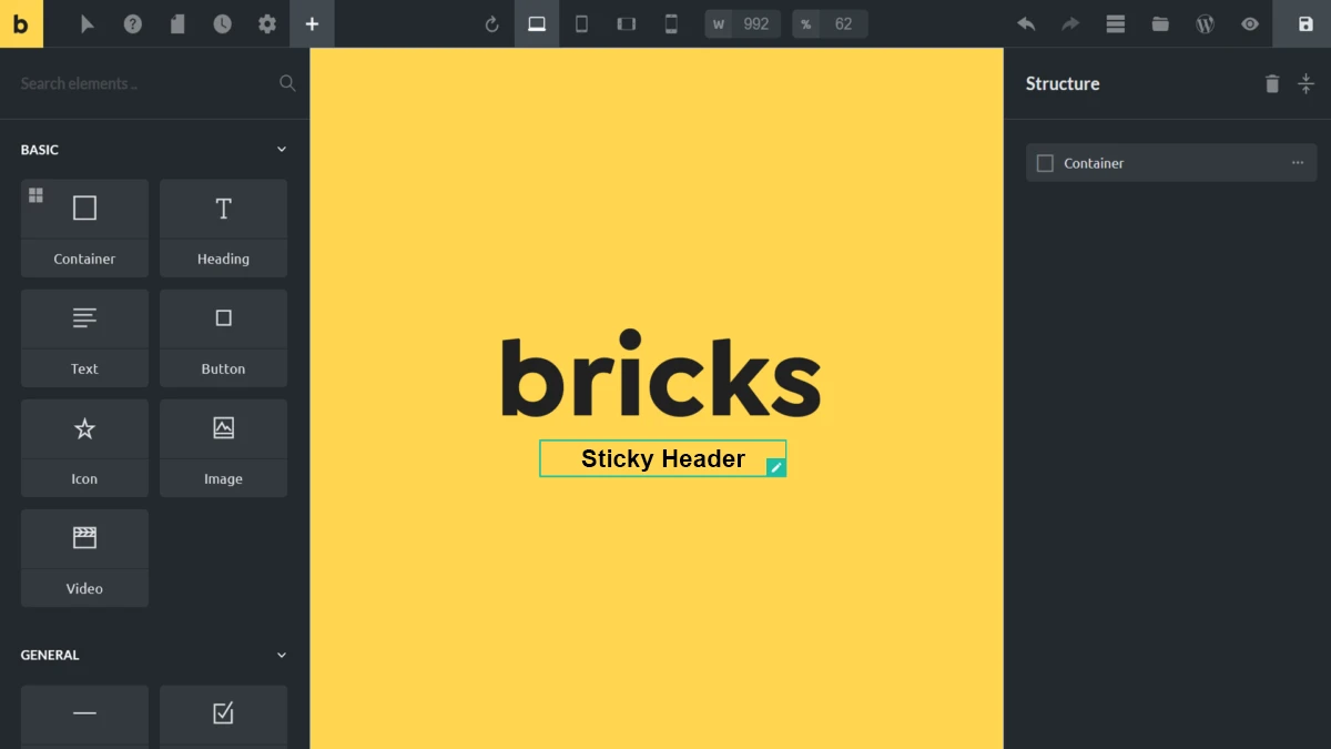
Using CSS Keyframes Animation in Bricks Builder
If you’re working with Bricks Builder, you don’t necessarily need to use a Code Element for these animations.
Most can be applied directly to regular Bricks elements using CSS classes.
For example, to create the staggered card animation:
- Add a container and set its layout to Grid.
- Add three child containers.
- Assign the class
stagger-cardto each child. - Add the animation CSS to your page’s custom CSS or a dedicated stylesheet.
- Preview the animation on the frontend.
The animation works because Bricks ultimately generates regular HTML elements.
For more complex examples involving specific markup, the Bricks Code Element is useful.
I personally prefer keeping reusable animations in a dedicated stylesheet rather than repeating the same CSS across multiple Bricks elements.
You can learn more about custom CSS and the Code Element in the official Bricks Academy documentation.
Best Practices for CSS Keyframes Animation
Prefer transforms and opacity
Properties like transform and opacity are generally good choices because browsers can often animate them efficiently without recalculating layout.
Keep animations subtle
A short entrance animation can improve the feel of a page. Too many simultaneous animations can make the same page distracting.
Use CSS variables
Instead of hardcoding every value, use custom properties for animation durations and distances.
:root {
  --animation-duration: 700ms;
  --animation-distance: 25px;
}

.reusable-animation {
  animation: reusable-reveal
    var(--animation-duration)
    ease-out
    both;
}

@keyframes reusable-reveal {
  from {
    opacity: 0;
    transform: translateY(var(--animation-distance));
  }

  to {
    opacity: 1;
    transform: translateY(0);
  }
}
This makes it easier to reuse the same animation across multiple components.
Respect reduced-motion preferences
Not everyone enjoys animated interfaces.
Use prefers-reduced-motion to remove or simplify nonessential animations.
Test on mobile devices
An animation that looks smooth on a desktop may behave differently on a lower-powered mobile device.
Always test the effects on real devices, especially when animating large backgrounds or shadows.
Common CSS Keyframes Animation Mistakes
Forgetting the animation duration
Defining @keyframes alone doesn’t make anything move.
You must apply the animation to an element and specify a duration greater than zero to see the effect over time.
Using infinite animations everywhere
infinite is useful for loading indicators and subtle background effects, but most entrance animations should run once.
Confusing transitions and animations
Use transitions for smooth changes between states, such as a button changing color on hover.
Use keyframes when you need multiple stages, repeating movement, or an animation that runs independently of a state change.
Ignoring animation-fill-mode
By default, an element can return to its underlying CSS styles when a finite animation finishes.
Using animation-fill-mode: forwards preserves the final keyframe values while the animation remains applied.
For delayed entrance animations, both is often more useful because it also applies the starting keyframe during the delay.
Animating too many expensive properties
Large shadows, filters, and background animations can involve additional rendering work.
Use them selectively and check performance rather than assuming every CSS animation is lightweight.
Final Thoughts
CSS keyframes animation is one of those features that becomes more useful the more you experiment with it.
You don’t need elaborate animations to make a website feel polished. Sometimes a small delay between cards, a subtle text reveal, or a well-designed loading indicator is enough.
Of the seven examples, I find staggered card animations and text reveals particularly useful for everyday website development. They’re easy to reuse and don’t require much additional markup.
I also like animated gradients and shimmer effects, although I would use them more selectively because of their rendering cost.
Try the playgrounds, experiment with the settings, and see which effects work for your projects.
If you’ve created an interesting animation using @keyframes, I’d love to hear about it. I’m particularly interested in small effects that make a noticeable difference without adding unnecessary complexity.
Frequently Asked Questions
What is CSS keyframes animation?
CSS keyframes animation allows you to define how an element’s CSS properties change over time. You create an animation using @keyframes and apply it using the animation property.
Can I create CSS animations without JavaScript?
Yes. CSS supports animations for movement, opacity, rotation, scaling, colors, backgrounds, and many other properties without JavaScript.
What is the difference between CSS transitions and keyframes?
Transitions animate changes between property values. Keyframes define an animation sequence that can include multiple stages, repeat automatically, and run independently of a state change.
How do I repeat a CSS keyframes animation?
Use animation-iteration-count: infinite or include infinite in the animation shorthand.
Why does my CSS animation return to its original position?
By default, a finite animation stops applying its animated values when it finishes. You can use animation-fill-mode: forwards to retain its final values while the animation remains applied.
Can CSS keyframes animation affect website performance?
Yes. Animations involving layout changes, large shadows, or background painting can consume more resources. Animating transforms and opacity is generally more efficient.
Can I use CSS keyframes animation in Bricks Builder?
Yes. Assign a CSS class to a Bricks element and apply the animation through custom CSS. You can also test complete examples inside a Bricks Code Element.
Do I need JavaScript for the interactive playgrounds?
The seven animation effects themselves are created using CSS. The playground controls use JavaScript to update settings, replay animations, and copy the generated code.
Should I use CSS or JavaScript for animations?
For simple visual effects, CSS is often sufficient. JavaScript becomes useful when animations depend on application state, user interaction, dynamic content, or more complex sequencing.
Resources
From Maya Grafix