The Problem: Too Many Typography Breakpoints
A few years ago, every responsive website I built followed the same pattern.
I’d set a heading size for desktop.
Then I’d check the tablet view and realize it looked too large.
So I’d create another breakpoint.
Then I’d check mobile and add yet another override.
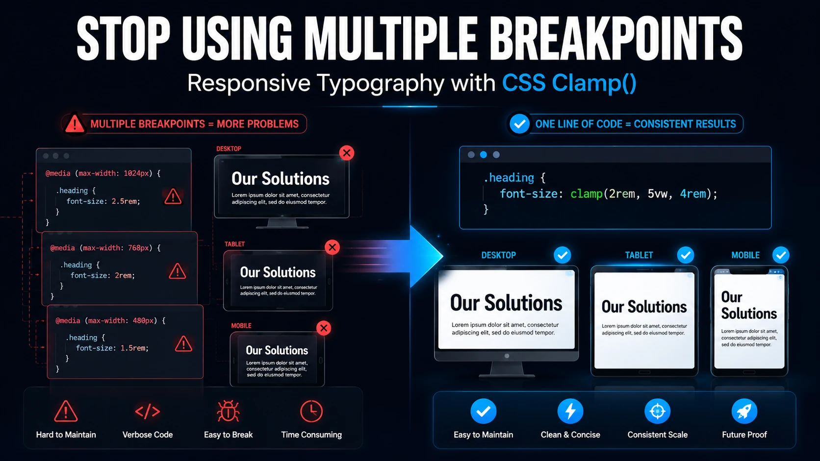
The CSS quickly turned into this:
/* CSS */

.hero-title {
  font-size: 64px;
}

@media (max-width: 1024px) {
  .hero-title {
    font-size: 48px;
  }
}

@media (max-width: 767px) {
  .hero-title {
    font-size: 32px;
  }
}
It worked.
But every time a client wanted the heading slightly larger or smaller, I had to revisit every breakpoint.
I ran into this while rebuilding a homepage hero section in Bricks Builder. The desktop version looked great. The tablet version felt oversized. Mobile looked cramped.
Instead of adding another breakpoint, I switched to CSS clamp().
The result was smoother, cleaner, and much easier to maintain.
Why Traditional Responsive Typography Gets Messy
Breakpoints are useful.
The problem is that typography doesn’t usually need sudden jumps in size.
A heading doesn’t magically need to become 48px at one screen width and 32px at another.
Ideally, it should scale gradually as the screen changes.
That’s exactly what clamp() allows us to do.
Instead of defining multiple font sizes at specific breakpoints, we define:
- A minimum size
- A preferred scaling value
- A maximum size
The browser handles everything in between.
What CSS Clamp Actually Does
The syntax is simple:
clamp(minimum, preferred, maximum)For example:
/* CSS */

font-size: clamp(2rem, 5vw, 4rem);
This tells the browser:
- Never go below 2rem
- Scale using 5vw
- Never exceed 4rem
As the viewport grows and shrinks, the value adjusts automatically.
Think of it as giving the browser a safe range instead of hard instructions.
Try the Playground Before Continuing
Reading about clamp() is one thing.
Seeing it work is much easier.
Use the playground below and experiment with different values.
A few things worth trying:
Experiment 1
Change:
/* CSS */

clamp(2rem, 5vw, 4rem)
to:
/* CSS */

clamp(1rem, 10vw, 8rem)
Watch how aggressively the heading scales.
Experiment 2
Keep the minimum and maximum values the same.
Only change:
5vwto:
2vwand then:
8vwYou’ll quickly see that the middle value controls how aggressively the scaling happens.
Experiment 3
Move the viewport slider from 320px to 1920px.
Pay attention to the calculated font size shown below the preview.
This is where clamp() finally starts to make sense.
CSS Clamp Playground
Experiment with different clamp() values and watch the heading resize in real time.
clamp(2rem, 5vw, 4rem)
The Quick Brown Fox
This heading uses your generated clamp value.
What You’re Actually Seeing in the Playground
One thing that confused me when I first learned clamp() was that it felt a little magical.
You enter three values and somehow the browser figures out the rest.
The playground above removes some of that mystery.
As you move the viewport slider, the browser is constantly calculating a value between your minimum and maximum limits.
That’s why the generated size changes smoothly instead of jumping between breakpoints.
Step 1: Replace Fixed Font Sizes with Clamp()
Let’s say your desktop heading is 64px and your mobile heading is around 32px.
Instead of creating multiple media queries:
/* CSS */

.hero-title {
    font-size: clamp(2rem, 5vw, 4rem);
}
Now the heading scales naturally between those values.
No additional breakpoints required.
Before moving on, try creating a heading in the playground that feels right on both mobile and desktop.
You’ll notice there isn’t a single perfect formula.
Different designs require different ranges.
Step 2: Use Clamp for Spacing
Typography isn’t the only thing that benefits from fluid scaling.
Spacing often creates even more breakpoint headaches.
For example:
/* CSS */

section {
    padding-top: clamp(40px, 8vw, 120px);
    padding-bottom: clamp(40px, 8vw, 120px);
}
Or:
/* CSS */

.card {
    padding: clamp(20px, 4vw, 60px);
}
This is where I noticed the biggest improvement.
Large desktop layouts maintained generous spacing while smaller devices automatically tightened things up.
Try recreating these values in the playground and imagine them controlling section spacing instead of typography.
The behavior is exactly the same.
Step 3: Use Clamp Inside Bricks Builder
One reason I like clamp() is that Bricks Builder supports it everywhere.
You can use it directly inside:
Typography Controls
/* CSS */

clamp(2rem, 5vw, 4rem)
Global Classes
/* CSS */

.heading-xl {
    font-size: clamp(2.5rem, 5vw, 5rem);
}
Custom CSS
/* CSS */

:root {
    --heading-xl: clamp(2.5rem, 5vw, 5rem);
}

h1 {
    font-size: var(--heading-xl);
}
The nice thing is that once you’ve found a value you like in the playground, you can simply copy it and paste it directly into Bricks.
How I Choose Clamp Values
This is usually my workflow.
I start by deciding:
- Smallest acceptable size
- Largest acceptable size
Then I adjust the middle value until the scaling feels natural.
For example:
/* CSS */

clamp(1rem, 3vw, 2rem)
If the growth feels too aggressive:
/* CSS */

clamp(1rem, 2vw, 2rem)
If it feels too subtle:
/* CSS */

clamp(1rem, 5vw, 2rem)
The playground is useful here because you can test dozens of combinations in seconds.
When Clamp Isn’t the Right Tool
I use clamp() on almost every project now.
But there are situations where traditional breakpoints still make sense.
Examples include:
- Complex layouts
- Mega menus
- Grid restructuring
- Component visibility changes
- Major design shifts between devices
Clamp is excellent for fluid values.
It’s not a replacement for responsive design as a whole.
Final Thoughts
CSS clamp() completely changed how I handle responsive typography.
Instead of maintaining multiple font-size declarations across several breakpoints, I can often replace everything with a single line of CSS.
The code is cleaner.
The scaling feels more natural.
And future design adjustments become much easier.
If you’re new to clamp(), don’t just copy the examples from this article.
Open the playground, experiment with the values, and see how the browser responds.
That’s the fastest way to understand why so many developers have started replacing breakpoint-based typography with fluid sizing.