If you’ve been writing CSS for a while, you’ve probably faced this situation.
A client asks for a simple branding update.
“Can we make the blue a little darker?”
It sounds like a five-minute job, but after opening the stylesheet, you discover the same color has been repeated in dozens of places. Buttons, links, icons, borders, cards, alerts—every component has the color hardcoded.
I’ve encountered this more times than I can count, especially while working on older projects. Even a small design change can become time-consuming when common values are scattered throughout the stylesheet.
This is exactly the problem CSS Variables were designed to solve.
Whether you’re building a simple landing page or a large web application, CSS Variables help keep your styles organized, consistent, and much easier to maintain.
The Problem
Consider this CSS.
.button {
    background: #2563eb;
    color: white;
}

.card-title {
    color: #2563eb;
}

a {
    color: #2563eb;
}

.icon {
    fill: #2563eb;
}
Everything looks fine until the client decides to change the primary color.
Now you have to search through the entire stylesheet and replace every occurrence manually.
The same thing happens with spacing, font sizes, border radius, shadows, and many other design values. Over time, maintaining the stylesheet becomes increasingly difficult.
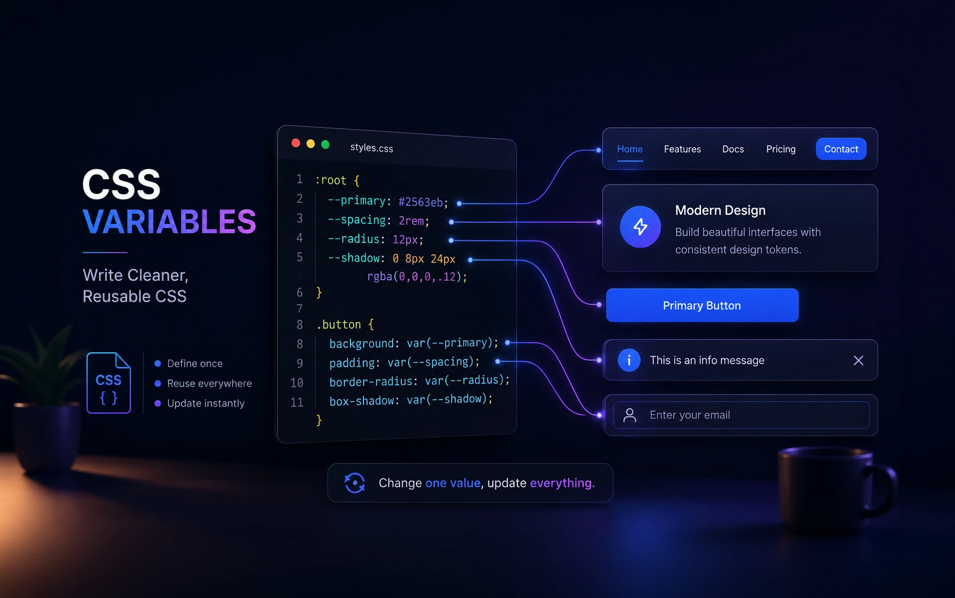
Instead of repeating values everywhere, CSS Variables allow you to define them once and reuse them throughout your project.
What Are CSS Variables?
CSS Variables, officially known as CSS Custom Properties, store reusable values that you can reference anywhere in your stylesheet.
Instead of repeating the same value repeatedly, define it once.
:root {
    --primary-color: #2563eb;
}
Then use the variable with the var() function.
.button {
    background: var(--primary-color);
}

.card-title {
    color: var(--primary-color);
}

a {
    color: var(--primary-color);
}

.icon {
    fill: var(--primary-color);
}
When your client requests a different primary color, updating the entire website becomes a one-line change.
:root {
    --primary-color: #1d4ed8;
}
Every element using that variable updates automatically.
Why It Happens
One question beginners often ask is why almost every example places variables inside :root.
:root {
    --primary-color: #2563eb;
    --secondary-color: #0f172a;
    --text-color: #333;
}
The :root selector represents the highest level of your document, making these variables globally available throughout the website.
That means every component can access them without redefining the values.
For global design settings like colors, typography, spacing, shadows, and border radius, :root is usually the best place to define your variables.
CSS Variables Aren’t Just for Colors
Many developers start using CSS Variables only for colors. That’s a good beginning, but they’re useful for almost every repeated design value in your project.
Once you begin using them consistently, you’ll find yourself creating variables for typography, spacing, shadows, border radius, transitions, breakpoints, and much more.
Spacing
Consistent spacing gives a website a much more polished appearance.
Instead of guessing padding values throughout your stylesheet, create a spacing scale.
:root {
    --spacing-xs: 0.5rem;
    --spacing-sm: 1rem;
    --spacing-md: 2rem;
    --spacing-lg: 4rem;
}
Now every component follows the same spacing system.
.card {
    padding: var(--spacing-md);
}

.hero {
    margin-top: var(--spacing-lg);
}

.sidebar {
    padding: var(--spacing-sm);
}
If you later decide to increase the spacing across the site, you only need to update the variables.
Typography
Typography is another excellent candidate for variables.
:root {
    --font-small: 0.9rem;
    --font-base: 1rem;
    --font-large: 2rem;
}
p {
    font-size: var(--font-base);
}

small {
    font-size: var(--font-small);
}

h1 {
    font-size: var(--font-large);
}
Keeping typography centralized makes redesigns significantly easier and helps maintain consistency throughout the project.
Border Radius
Rounded corners often appear across multiple components.
Instead of repeating the same value everywhere:
.card {
    border-radius: 12px;
}

.button {
    border-radius: 12px;
}

.modal {
    border-radius: 12px;
}
Define it once.
:root {
    --radius: 12px;
}

.card,
.button,
.modal {
    border-radius: var(--radius);
}
A future redesign becomes a simple one-line update.
Box Shadows
Consistent shadows create a stronger visual hierarchy.
:root {
    --shadow: 0 8px 24px rgba(0, 0, 0, .12);
}
.card {
    box-shadow: var(--shadow);
}

.dialog {
    box-shadow: var(--shadow);
}
Rather than experimenting with slightly different shadows for every component, a single reusable variable keeps everything looking cohesive.
Using CSS Variables with calc()
One feature I use regularly is combining CSS Variables with calc(). It keeps layouts flexible while avoiding repeated values.
Imagine a layout with a fixed-width sidebar.
:root {
    --sidebar-width: 280px;
}

.content {
    width: calc(100% - var(--sidebar-width));
}
If the sidebar width changes later, you only update one variable.
Everything that depends on it adjusts automatically.
I’ve found this approach especially useful when building admin dashboards, documentation sites, and web applications where layout dimensions often change during development.
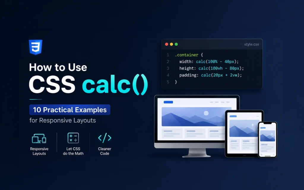
If you’d like to explore more practical uses of calc(), have a look at my article How to Use CSS calc(): 10 Practical Examples for Responsive Layouts, where I cover several real-world examples beyond simple width calculations.
Responsive Variables with clamp()
CSS Variables also work perfectly with clamp().
:root {
    --heading-size: clamp(2rem, 5vw, 4rem);
}

h1 {
    font-size: var(--heading-size);
}
Instead of writing multiple media queries for typography, clamp() automatically scales between your minimum and maximum values.
Because the value is stored in a variable, every heading using it stays perfectly synchronized.
This keeps your CSS cleaner and makes future adjustments much easier.
I covered clamp() in more detail in my article CSS Clamp: Build Responsive Layouts Without Endless Media Queries, including practical examples for responsive typography, spacing, and component sizing.
Component-Level Variables
While :root is the ideal place for global variables, CSS Variables don’t have to be global.
You can define variables inside individual components to make them more reusable.
.card {
    --card-bg: white;
    --card-text: #333;

    background: var(--card-bg);
    color: var(--card-text);
}
Now creating a dark version of the card becomes very simple.
.card.dark {
    --card-bg: #1f2937;
    --card-text: #ffffff;
}
The styling inside the component doesn’t change. Only the variable values do.
This approach is particularly useful when building reusable UI components or design systems.
Fallback Values
Sometimes a variable might not exist.
In those situations, you can provide a fallback value.
color: var(--primary-color, blue);
If --primary-color has been defined, that value is used.
If not, the browser falls back to blue.
Fallbacks are especially useful when building reusable components that could be used across different projects.
Variables Referencing Other Variables
One useful feature of CSS Variables is that they can reference other variables.
:root {
    --primary-color: #2563eb;
    --button-background: var(--primary-color);
}
Now every button automatically uses the primary color.
If the primary color changes, the button background updates as well.
This creates a hierarchy of variables that becomes very useful in larger projects.
Dark Mode with CSS Variables
Dark mode is one of my favourite use cases for CSS Variables.
Without variables, supporting light and dark themes usually means writing duplicate CSS.
With variables, the CSS stays almost identical.
:root {
    --background: #ffffff;
    --text-color: #222222;
}

body {
    background: var(--background);
    color: var(--text-color);
}
Switch to dark mode simply by changing the variable values.
.dark {
    --background: #111827;
    --text-color: #f9fafb;
}
Every element using those variables updates automatically.
I’ve found this approach much easier to maintain than creating separate stylesheets or overriding dozens of selectors.
CSS Variables and Native CSS Nesting
If you’re already using Native CSS Nesting, CSS Variables make the code even cleaner.
:root {
    --primary-color: #2563eb;
    --radius: 12px;
}

.button {
    background: var(--primary-color);
    border-radius: var(--radius);

    &:hover {
        opacity: .9;
    }

    .icon {
        fill: var(--primary-color);
    }
}
Nesting keeps related styles together, while variables ensure design values stay consistent throughout the project.
The combination results in CSS that’s easier to read, easier to maintain, and contains much less duplication.
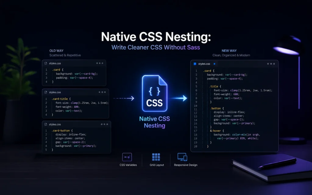
If you haven’t explored Native CSS Nesting yet, I recommend reading my article Native CSS Nesting: Write Cleaner CSS Without Sass, where I explain how it works and why it has become one of my favourite additions to modern CSS.
Best Practices
After using CSS Variables in production projects for several years, these habits have become part of my workflow.
- Keep global variables inside
:root. - Group related variables together, such as colors, spacing, typography, and shadows.
- Use descriptive names like
--primary-colorinstead of--blue. - Prefer semantic names such as
--success-coloror--error-colorinstead of actual color names. - Don’t create a variable for every single value. If a value is only used once, hardcoding it usually keeps the stylesheet simpler.
- Keep your variable names consistent across projects whenever possible.
Common Mistakes
Creating Too Many Variables
Not every value needs to become a variable.
If a value only appears once, creating a variable often adds unnecessary complexity.
Naming Variables by Color
This is a common mistake.
Instead of:
--blue: #2563eb;
Prefer:
--primary-color: #2563eb;
If your branding changes from blue to green, the variable name still makes sense.
Forgetting Variable Scope
Variables defined inside a component are only available within that scope.
If another component needs the same value, consider moving it to :root.
Mixing Units
Try to stay consistent with your units.
If most of your typography uses rem, avoid introducing px values without a good reason.
Consistency makes your CSS much easier to understand.
Final Thoughts
CSS Variables have become a standard part of my workflow. Almost every project starts with a small collection of variables for colors, typography, spacing, border radius, and shadows.
As projects grow, having those values defined in one place saves a surprising amount of time. Design updates become easier, components stay consistent, and the stylesheet remains much easier to maintain.
When you combine CSS Variables with modern features like calc(), clamp(), and Native CSS Nesting, your CSS becomes cleaner, more flexible, and significantly easier to work with.
If you’re still hardcoding repeated values throughout your stylesheets, CSS Variables are one of the simplest improvements you can make. Once you start using them consistently, you’ll probably wonder how you ever managed without them.
Here are some of the resources if you need more information:
https://developer.mozilla.org/en-US/docs/Web/CSS/Guides/Cascading_variables/Using_custom_properties
https://www.w3schools.com/css/css3_variables.asp
https://www.geeksforgeeks.org/css/css-variables
FAQs
CSS Variables, also called CSS Custom Properties, are reusable values that you define once and use throughout your stylesheet with the var() function.
Yes. CSS Variables are supported by all modern browsers and are safe to use in production websites.
Yes. JavaScript can update CSS Variables dynamically.
document.documentElement.style.setProperty(
    "--primary-color",
    "#16a34a"
);
This is commonly used for theme switching, user customization, and interactive interfaces.
You can redefine CSS Variables inside media queries, allowing every element using those variables to update automatically.
However, you can’t currently use var() directly in the media query condition itself.
Sass variables are replaced during compilation and don’t exist in the browser.
CSS Variables remain available at runtime, allowing them to change dynamically through JavaScript, themes, user preferences, or state changes.
For most modern websites, absolutely.
Even defining variables for colors, spacing, typography, and shadows makes future maintenance much easier and helps keep your design consistent.