A client recently sent me a link to one of their competitor’s websites and asked a simple question.
“Can we stop users from pinching to zoom on mobile? Look at my competitor website. It doesn’t allow it.”
The reason was understandable. When users zoomed into some of the images on their own website, the images didn’t look as sharp as expected. The client assumed the easiest solution was to stop users from zooming altogether.
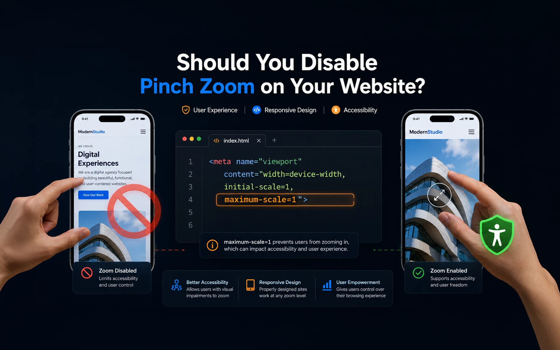
I inspected the competitor’s website and quickly found the reason. It wasn’t JavaScript or a special plugin—it was simply the viewport meta tag.
Technically, it’s a one-line change.
But whether you should do it is a completely different discussion.
Why Clients Ask to Disable Pinch Zoom
This is a request many web developers eventually receive.
Clients often believe that disabling zoom will:
- Prevent users from noticing image quality issues.
- Keep the layout looking exactly as designed.
- Avoid accidental zooming while scrolling.
- Make the website feel more like a mobile app.
From a design perspective, these concerns make sense.
However, from a usability and accessibility perspective, removing pinch zoom can create a much bigger problem.
How Websites Disable Pinch Zoom
Most websites include a viewport meta tag inside the <head> section.
A typical viewport tag looks like this:
<meta
    name="viewport"
    content="width=device-width, initial-scale=1.0">
To prevent users from zooming, some websites modify it like this:
<meta
    name="viewport"
    content="width=device-width,
             initial-scale=1,
             minimum-scale=1,
             maximum-scale=1,
             user-scalable=no">
Some websites omit user-scalable=no and instead rely on setting both the minimum and maximum scale to 1, as in the example below:
<meta
    name="viewport"
    content="width=device-width,
             initial-scale=1,
             minimum-scale=1,
             maximum-scale=1">
Since the page cannot scale beyond its initial size, pinch zoom is effectively disabled on many mobile browsers.
What Each Attribute Does
| Attribute | Purpose |
|---|---|
width=device-width | Sets the viewport width to match the device width. |
initial-scale=1 | Displays the page at 100% when it first loads. |
minimum-scale=1 | Prevents users from zooming out. |
maximum-scale=1 | Prevents users from zooming in beyond 100%. |
user-scalable=no | Explicitly disables user zooming on browsers that honor this setting. |
It only takes a single line of HTML to change this behavior.
But just because it’s easy doesn’t mean it’s the right approach.
Why I Usually Don’t Recommend It
When someone pinches to zoom, they’re usually trying to read something more clearly.
That might be:
- Small text
- Product images
- Technical drawings
- Charts
- Maps
- Tables
- Any content that is difficult to see on a small screen
Not everyone has perfect eyesight, and mobile screens continue to vary greatly in size.
By preventing zoom, you’re removing a feature that many users rely on every day.
In my experience, it’s better to solve the underlying problem instead of hiding it.
Accessibility Matters
Accessibility isn’t just about screen readers.
Many users depend on browser zoom because of:
- Low vision
- Age-related eyesight changes
- Small mobile displays
- Bright outdoor conditions
- Fine details in images
The Web Content Accessibility Guidelines (WCAG) recommend that users should be able to zoom content significantly without losing functionality. Disabling browser zoom can make a website harder—or sometimes impossible—for some people to use comfortably.
Even if accessibility regulations don’t apply to your project today, building websites that are usable by everyone is simply good development practice.
Better Ways to Improve the Experience
If your concern is image quality when users zoom in, there are much better solutions.
Upload Higher-Resolution Images
If an image becomes blurry when zoomed, it often means the original image isn’t large enough.
Start with a higher-resolution source image instead of trying to hide the problem.
Use Responsive Images
WordPress automatically generates multiple image sizes and serves the most appropriate one using srcset.
Make sure you’re not forcing a small thumbnail where a larger image should be displayed.
Use Modern Image Formats
Formats like WebP provide excellent image quality while keeping file sizes relatively small.
This often allows you to use higher-quality images without significantly affecting page speed.
Provide a Lightbox for Images
If your website contains products, portfolios, or technical images, allowing users to open them in a lightbox provides a much better experience than preventing zoom altogether.
Make Text Easier to Read
If users frequently zoom just to read content, consider increasing your base font size, improving line spacing, and checking the site’s readability on smaller screens.
Are There Any Situations Where Disabling Zoom Makes Sense?
There are a few niche situations where disabling pinch zoom may be acceptable.
Examples include:
- Full-screen kiosks
- Interactive displays
- Certain web-based games
- Dedicated touchscreen applications running on controlled hardware
In these environments, the website behaves more like a custom application than a public website.
For most business websites, blogs, portfolios, and eCommerce stores, I would avoid disabling zoom.
My Recommendation
Personally, I don’t disable pinch zoom on client websites.
If a client tells me that images don’t look good when users zoom in, I treat that as an image quality issue rather than an accessibility issue.
Using better images, responsive image sizes, and proper optimization produces a much better experience than preventing visitors from zooming.
This has become my standard workflow because it solves the actual problem instead of masking it.
Final Thoughts
The viewport meta tag makes it incredibly easy to disable pinch zoom.
However, easy doesn’t always mean better.
Removing zoom may hide image quality issues, but it also removes an important accessibility feature that many people rely on every day.
If you’re building websites that are intended for real users on real devices, I’d recommend focusing on improving image quality and readability instead of preventing users from interacting with your content the way they need to.
In the long run, that’s a much better experience for everyone.
Frequently Asked Questions
On many mobile browsers, yes. When the minimum and maximum scale are both set to 1, users cannot zoom beyond the initial scale. Browser behavior may vary, and some browsers intentionally ignore these restrictions for accessibility reasons.
Many browsers recognize it, but some mobile browsers ignore it or override it to preserve accessibility features.
In most cases, yes. Preventing users from zooming can make content difficult to read for people with low vision or anyone who needs magnification.
No. It only prevents users from noticing image quality issues. The better solution is to use higher-resolution, properly optimized images.
No. Most WordPress themes output a standard viewport tag that allows users to zoom. Restricting zoom requires intentionally modifying the viewport meta tag.