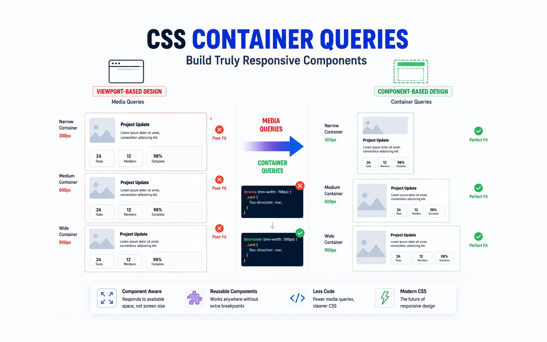
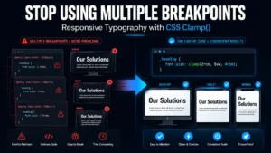
Responsive design has relied on media queries for years. While media queries are excellent for adapting layouts based on the viewport size, they have one major limitation—they only know about the browser window, not the actual space available to a component.
Imagine a card component that appears in a sidebar on one page and in a full-width section on another. With traditional media queries, the card responds to the screen size, not the space it occupies. This often leads to complicated CSS and multiple breakpoints.
Container Queries solve this problem by allowing components to respond to the size of their parent container instead of the viewport.
What Are Container Queries?
A Container Query lets you apply styles based on the dimensions of a parent container.
Instead of asking:
@media (min-width: 768px) {
    .card {
        display: flex;
    }
}
You can ask:
@container (min-width: 500px) {
    .card {
        display: flex;
    }
}
The difference is significant. The card now changes its layout when its container reaches 500px wide, regardless of the browser width.
Why This Matters
Container Queries make components truly reusable.
A single component can adapt automatically whether it’s placed in:
- A narrow sidebar
- A two-column layout
- A full-width section
- A popup modal
- A WooCommerce product grid
The component becomes self-aware of its available space instead of depending on global breakpoints.
Setting Up a Container
Before using a container query, you must declare a container.
.card-wrapper {
    container-type: inline-size;
}
You can also give it a name:
.card-wrapper {
    container-type: inline-size;
    container-name: card-container;
}
Creating a Container Query
Once the container is defined, you can target it like this:
@container card-container (min-width: 500px) {
    .card {
        display: flex;
        gap: 20px;
    }
}
When the container becomes wider than 500px, the card automatically switches to a horizontal layout.
A Practical Example
Let’s create a responsive card component.
<!doctype html>
<html lang="en">
    <head>
        <meta charset="UTF-8" />
        <meta name="viewport" content="width=device-width, initial-scale=1.0" />
        <title>Container Query Demo</title>

        <style>
            * {
                box-sizing: border-box;
                margin: 0;
                padding: 0;
            }

            body {
                font-family: Arial, sans-serif;
                padding: 40px;
                background: #f5f5f5;
            }

            /* Parent Grid */

            .dashboard {
                display: grid;
                grid-template-columns: 1fr 2fr;
                gap: 30px;
            }

            /* Widget Container */

            .widget {
                container-type: inline-size;
                background: #fff;
                border-radius: 12px;
                padding: 20px;
                box-shadow: 0 5px 15px rgba(0, 0, 0, 0.08);
            }

            /* Default Mobile Layout */

            .team-card {
                display: flex;
                flex-direction: column;
                gap: 15px;
            }

            .team-image {
                width: 100%;
                height: 200px;
                background: #ddd;
                border-radius: 8px;
            }

            .team-content h3 {
                margin-bottom: 10px;
            }

            .team-stats {
                display: grid;
                grid-template-columns: 1fr;
                gap: 10px;
                margin-top: 15px;
            }

            .stat {
                background: #f1f1f1;
                padding: 15px;
                border-radius: 8px;
                text-align: center;
            }

            /* Container Query */

            @container (min-width: 500px) {
                .team-card {
                    flex-direction: row;
                    align-items: center;
                }

                .team-image {
                    width: 220px;
                    flex-shrink: 0;
                }

                .team-content {
                    flex: 1;
                }

                .team-stats {
                    grid-template-columns: repeat(3, 1fr);
                }
            }

            /* Page Responsive */

            @media (max-width: 900px) {
                .dashboard {
                    grid-template-columns: 1fr;
                }
            }
        </style>
    </head>

    <body>
        <h2 style="margin-bottom: 20px">Container Query Example</h2>

        <div class="dashboard">
            <!-- Narrow Container -->

            <div class="widget">
                <div class="team-card">
                    <div class="team-image"></div>

                    <div class="team-content">
                        <h3>Marketing Team</h3>

                        <p>
                            This widget is inside a narrow column. Container
                            queries keep the layout stacked.
                        </p>

                        <div class="team-stats">
                            <div class="stat">24 Projects</div>
                            <div class="stat">12 Clients</div>
                            <div class="stat">98% Success</div>
                        </div>
                    </div>
                </div>
            </div>

            <!-- Wide Container -->

            <div class="widget">
                <div class="team-card">
                    <div class="team-image"></div>

                    <div class="team-content">
                        <h3>Development Team</h3>

                        <p>
                            This widget is inside a much wider container. The
                            same component automatically switches to a
                            horizontal layout and 3-column stats grid.
                        </p>

                        <div class="team-stats">
                            <div class="stat">48 Projects</div>
                            <div class="stat">31 Clients</div>
                            <div class="stat">99% Success</div>
                        </div>
                    </div>
                </div>
            </div>
        </div>
    </body>
</html>
This example demonstrates the real value of Container Queries:
- Both widgets use the exact same HTML.
- Both widgets use the exact same CSS.
- One widget stays stacked because its container is narrow.
- The other automatically becomes horizontal because its container is wider.
- No extra classes.
- No JavaScript.
- No viewport-based media queries controlling the component.
Try It Yourself Using CodePen
Reading about Container Queries is one thing, but seeing them in action makes the concept much easier to understand. Fortunately, you don’t need to set up a local development environment to experiment with the code. We can use CodePen, a free online playground for HTML, CSS, and JavaScript.
Step 1: Open CodePen
Visit:
Click the Signup for free or login.
Step 2: Create a New Pen
Once you’re logged in, click Create → Pen from the top menu.
You’ll see three code panels:
- HTML
- CSS
- JavaScript
Along with a live preview area.
Step 3: Copy the HTML
Take this code and paste it into the HTML panel.
<div class="dashboard">

    <!-- Narrow Widget -->
    <div class="widget">
        <div class="team-card">

            <div class="team-image"></div>

            <div class="team-content">
                <h3>Marketing Team</h3>

                <p>
                    This widget is inside a narrow column.
                    Container queries keep the layout stacked.
                </p>

                <div class="team-stats">
                    <div class="stat">
                        <strong>24</strong><br>
                        Projects
                    </div>

                    <div class="stat">
                        <strong>12</strong><br>
                        Clients
                    </div>

                    <div class="stat">
                        <strong>98%</strong><br>
                        Success
                    </div>
                </div>

            </div>

        </div>
    </div>

    <!-- Wide Widget -->
    <div class="widget">
        <div class="team-card">

            <div class="team-image"></div>

            <div class="team-content">
                <h3>Development Team</h3>

                <p>
                    This widget is inside a much wider container.
                    The same component automatically switches to a horizontal layout and multi-column stats grid.
                </p>

                <div class="team-stats">
                    <div class="stat">
                        <strong>48</strong><br>
                        Projects
                    </div>

                    <div class="stat">
                        <strong>31</strong><br>
                        Clients
                    </div>

                    <div class="stat">
                        <strong>99%</strong><br>
                        Success
                    </div>
                </div>

            </div>

        </div>
    </div>

</div>
Step 4: Copy the CSS
Now paste the following code into the CSS panel:
*{
    box-sizing:border-box;
    margin:0;
    padding:0;
}

body{
    font-family:Arial,sans-serif;
    background:#f5f5f5;
    padding:40px;
}

/* Dashboard Layout */

.dashboard{
    display:grid;
    grid-template-columns:1fr 2fr;
    gap:30px;
    max-width:1200px;
    margin:auto;
}

/* Container Query Parent */

.widget{
    container-type:inline-size;
    background:#ffffff;
    padding:20px;
    border-radius:12px;
    box-shadow:0 5px 15px rgba(0,0,0,.08);
}

/* Component */

.team-card{
    display:flex;
    flex-direction:column;
    gap:15px;
}

.team-image{
    width:100%;
    height:220px;
    background:linear-gradient(
        135deg,
        #3b82f6,
        #2563eb
    );
    border-radius:8px;
}

.team-content h3{
    margin-bottom:10px;
}

.team-content p{
    line-height:1.6;
    color:#555;
}

/* Stats */

.team-stats{
    display:grid;
    grid-template-columns:1fr;
    gap:10px;
    margin-top:20px;
}

.stat{
    background:#f1f5f9;
    padding:15px;
    text-align:center;
    border-radius:8px;
}

/* Container Query */

@container (min-width: 500px){

    .team-card{
        flex-direction:row;
        align-items:center;
    }

    .team-image{
        width:220px;
        flex-shrink:0;
        height:220px;
    }

    .team-content{
        flex:1;
    }

    .team-stats{
        grid-template-columns:repeat(3,1fr);
    }

}

/* Responsive Page Layout */

@media (max-width: 900px){

    .dashboard{
        grid-template-columns:1fr;
    }

}
Step 5: Watch the Preview Update
As soon as you paste the code, CodePen will automatically render the layout in the preview window.
You should notice:
- The left widget remains stacked.
- The right widget becomes horizontal.
- Both widgets use exactly the same markup and CSS.
Step 6: Experiment with the Container Query
Things to Try
- Change:
@container (min-width: 500px)
to:
@container (min-width: 700px)
- Change:
grid-template-columns:1fr 2fr;
to:
grid-template-columns:1fr 1fr;
- Change:
grid-template-columns:1fr 2fr;
to:
grid-template-columns:1fr 3fr;
Notice how the same component automatically adapts based on the space available inside its parent container. This is the key advantage of Container Queries and something that would be difficult to achieve cleanly using only Media Queries.
What to Observe
The most important thing to understand is that the component isn’t reacting to the browser width. Instead, it’s reacting to the width of its parent container.
This is the key difference between Media Queries and Container Queries:
- Media Queries ask, “How wide is the browser?”
- Container Queries ask, “How much space does this component have?”
Once you see this behavior in CodePen, the value of Container Queries becomes immediately clear.
Container Queries in WordPress
This is where Container Queries become particularly useful.
If you’ve worked with Elementor, Bricks Builder, or Oxygen, you’ve probably encountered situations where the same component appears in different layouts.
Examples include:
- Blog cards in different grid layouts
- WooCommerce product cards
- Team member cards
- Testimonial blocks
- Custom query loop items
Traditionally, we would create several media query breakpoints. With Container Queries, the component can adapt automatically based on the space available.
Browser Support
Container Queries are now supported by all major modern browsers.
This includes:
- Chrome
- Edge
- Firefox
- Safari
For most modern projects, browser support is no longer a concern.
Media Queries vs Container Queries
| Media Queries | Container Queries |
|---|---|
| Respond to viewport size | Respond to container size |
| Global layout control | Component-level control |
| Less reusable | Highly reusable |
| Best for page layouts | Best for components |
When to Use Container Queries
Container Queries are not a replacement for Media Queries.
Use Media Queries when:
- Changing overall page layouts
- Adjusting navigation
- Controlling global spacing
Use Container Queries when:
- Building reusable components
- Creating cards and widgets
- Designing grid items
- Developing WordPress blocks and templates
The two techniques work best together.
Final Thoughts
Container Queries are one of the most important CSS features introduced in recent years.
They allow components to adapt based on the space they actually have rather than the size of the browser window. For WordPress developers working with Bricks Builder, Elementor, or custom themes, this means cleaner CSS, fewer breakpoints, and truly reusable components.
I’ve started using Container Queries in several WordPress projects, especially when building reusable cards and loop templates. They make components much easier to maintain and significantly reduce the number of media queries needed. If you haven’t explored them yet, they’re well worth adding to your CSS toolkit.