For many years, one of my favourite features of Sass was nesting.
Writing related CSS inside the parent selector always felt more natural. It matched the way we think about components — a card contains a title, a button, an image, and different states.
The problem was that regular CSS did not support this.
If you wanted nesting, you needed a CSS preprocessor like Sass.
But CSS has changed a lot in recent years. Features like custom properties, clamp(), Grid, Flexbox, and now native CSS nesting have made modern CSS much more powerful.
Today, many things that required additional tools can be done directly in the browser.
The Old Way of Writing CSS
Normally, we write selectors separately:
.card {
    background: white;
    padding: 2rem;
    border-radius: 1rem;
}

.card h2 {
    font-size: 2rem;
}

.card p {
    color: #555;
}

.card:hover {
    transform: translateY(-5px);
}
There is nothing wrong with this.
But as projects grow, related styles start getting separated across hundreds or thousands of lines.
When working on a component, I personally prefer keeping related styles together.
That is where nesting helps.
What Is Native CSS Nesting?
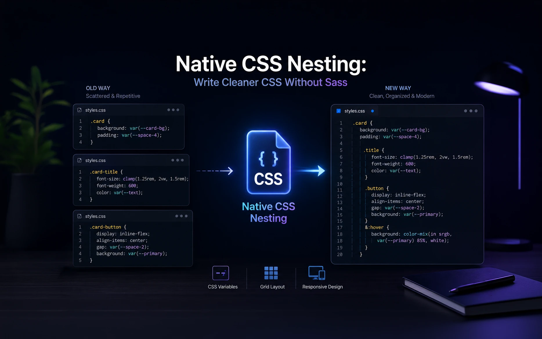
Native CSS nesting allows us to place CSS rules inside another CSS rule.
The same example can now be written like this:
.card {
    background: white;
    padding: 2rem;
    border-radius: 1rem;

    h2 {
        font-size: 2rem;
    }

    p {
        color: #555;
    }

    &:hover {
        transform: translateY(-5px);
    }
}
This is valid CSS.
No Sass.
No compiler.
No build process.
The browser understands it directly.
Understanding the & Selector
If you have used Sass before, this will look familiar.
The & symbol represents the current selector.
Example:
.button {
    background: black;
    color: white;

    &:hover {
        background: #333;
    }
}
The browser treats it like:
.button:hover {
    background: #333;
}
This becomes very useful when adding states like:
.element {
    &:hover {}
    &:focus {}
    &.active {}
}
Everything connected to that element stays together.
Using Native CSS Nesting With Components
Modern websites are usually built with components.
A card component may have:
- image
- title
- content
- button
Instead of writing:
.team-card {}

.team-card img {}

.team-card .title {}

.team-card .button {}
we can organize it:
.team-card {
    padding: 2rem;

    img {
        width: 100%;
    }

    .title {
        font-size: clamp(1.5rem, 3vw, 3rem);
    }

    .button {
        margin-top: 1rem;
    }
}
The CSS structure now follows the HTML structure.
In my experience, this makes maintenance much easier.
Nesting Media Queries
This is one of the areas where I find native nesting really useful.
Earlier:
.hero {
    padding: 6rem;
}

@media(max-width:768px) {
    .hero {
        padding: 3rem;
    }
}
Now:
.hero {
    padding: 6rem;

    @media(max-width:768px) {
        padding: 3rem;
    }
}
The responsive rules stay with the original component.
When you come back to the project after months, you don’t have to search through multiple sections of the stylesheet.
Native CSS Nesting and WordPress Development
For WordPress development, especially when working with page builders like Bricks Builder, Elementor, or Oxygen, native CSS nesting fits very naturally.
Most builders already encourage a component-based workflow.
For example:
.pricing-card {
    background: var(--card-bg);
    padding: clamp(2rem, 5vw, 5rem);

    .heading {
        font-size: clamp(2rem, 4vw, 4rem);
    }

    .price {
        font-weight: bold;
    }

    .button {
        margin-top: 2rem;

        &:hover {
            opacity: .8;
        }
    }
}
This keeps custom CSS easier to read.
Should We Stop Using Sass?
Not necessarily.
Sass still has useful features and many large projects depend on it.
But for many websites, especially WordPress projects, I find myself needing Sass less than before.
Modern CSS already gives us:
CSS variables for reusable values.
Grid and Flexbox for layouts.
clamp() for responsive sizing.
Native nesting for organization.
For many projects, that is enough.
Common Mistake: Too Much Nesting
Just because nesting exists does not mean everything should be nested.
Avoid this:
.header {
    nav {
        ul {
            li {
                a {
                    color: red;
                }
            }
        }
    }
}
Deep nesting creates selectors that become harder to manage.
I usually keep nesting only two or three levels deep.
Simple CSS is always easier to maintain.
Browser Support
Native CSS nesting is supported in all modern browsers including Chrome, Edge, Firefox, and Safari.
For new projects targeting modern browsers, it is ready to use.
If you need more information about native CSS nesting, this MDN article is a very good source.
Final Thoughts
CSS has changed a lot over the last few years.
Many features we depended on external tools for are slowly becoming part of the browser itself.
Native CSS nesting is not about replacing every tool. It is about simplifying the workflow when we don’t need extra complexity.
For most websites I build today, modern CSS features already provide a clean and maintainable development experience.
Sometimes the best improvement is not adding another tool — it is removing one.
FAQs
Not completely. Sass still has additional features, but many developers who only used Sass for nesting may no longer need it.
Yes. Native CSS nesting works well with WordPress themes, custom plugins, and builders like Bricks Builder.
No. The browser supports it directly.
No. The main concern is readability. Avoid creating very deep nested selectors.
A practical approach is to keep nesting around two or three levels.