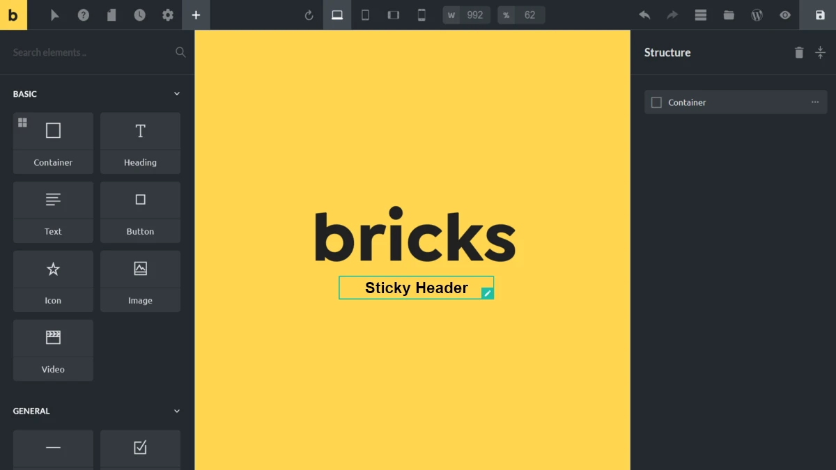
As a web developer, I’ve had the pleasure of working with three of the most popular WordPress page builders: Elementor, Oxygen, and now Bricks Builder. Each has its own strengths, but after diving into Bricks to revamp my website, I can confidently say Bricks is a game-changer. Like any builder, though, Bricks presents unique challenges—one of which I recently encountered: making an inner container sticky without affecting the entire header.
In Elementor and Oxygen, setting up a sticky inner container is relatively straightforward. But with Bricks, I found myself stumped. Despite my best efforts—using custom jQuery, plugins, and built-in sticky options—nothing achieved the smooth, subtle effect I envisioned. I needed a sticky inner container with an animated effect that would adjust the logo size and padding upon scroll, creating a sleek, dynamic look rather than a static one.
The Solution: Bricks Sticky Header with a Dynamic Class
After days of testing and troubleshooting, I found a lifesaving solution on StackOverflow. The idea was surprisingly simple yet effective: both containers reside inside a div with the ID #brx-header, which itself becomes sticky. As you scroll, a .scrolling class is dynamically added to the div, allowing you to target it and apply custom styling on scroll.
With this approach, I was able to add smooth transition of hiding the top container — all while keeping the inner container perfectly sticky. Here’s the core code that brought it to life:
/*css*/
#brx-header.scrolling {
    transform: translateY(-40px);  /* Adjust based on your top bar's height */
}
How It Works
The #brx-header.scrolling selector lets us apply a transformation, moving the header up by -40px when it begins scrolling. Adjust this value to match the height of any top bar or extra space you have.
My Own Modifications
As any developer knows, it’s not just about taking a solution and using it as-is—it’s about making it your own. I added a few personal touches to make the header slimmer and to adjust the logo size purely through CSS:
/*css*/
#masthead-logo {
    transition: all 0.3s ease-in-out;
}

#brx-header.scrolling #masthead {
    padding: 5px 20px !important;
}

#brx-header.scrolling #masthead-logo {
    width: 120px !important;
}
How These Modifications Work
- The
#masthead-logoincludes a smooth transition effect, ensuring the logo resizes seamlessly. - By adjusting padding and width with
#brx-header.scrolling, I achieved a sleek, professional effect that resizes the header and logo while scrolling. - The
!importantattribute on the padding and logo width is essential to ensure consistent styling.
The result? A beautifully functioning sticky header with dynamic adjustments to padding and logo size during scroll. You can see it in action on my live site: mayagrafix.com.
Final Thoughts: The Power of Bricks Builder
In web development, finding solutions often requires digging through forums, experimenting, and learning from others in the community. With Bricks Builder, I’ve discovered a flexible, powerful tool that empowers me to bring even the most complex design ideas to life. The sticky inner container challenge, while initially frustrating, ultimately reinforced my confidence in Bricks Builder as my go-to WordPress page builder.
A huge thank you to the unknown developer who originally shared this solution—it truly saved me. If you’re a developer transitioning from Elementor or Oxygen to Bricks, I highly recommend trying this approach for a custom sticky header effect.